News Graph
Visualizing The News
Exploring innovative ways in which we can navigate today’s news broadcast.
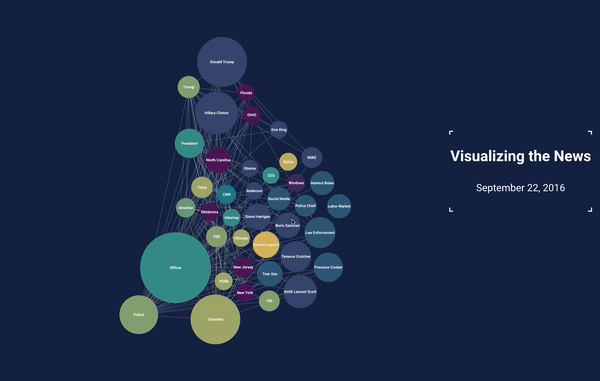
This interactive data visualization is showing the underlaying connections between the top entities mentioned in the news.
It enables the user to get a quick glance on today’s images - mapping sizes to the number of mentions and colors to types of entities. But also encouraging diving in, and discovering new stories she might not have heard of.
More documentation about this project can be found here
June 2016